| Latest | Greatest | Lobby | Journals | Search | Options | Help | Login |
|
|
|
This topic is archived. |
| Home » Discuss » Archives » General Discussion (Through 2005) |
|
| QC
|
Wed Oct-15-03 02:02 AM Original message |
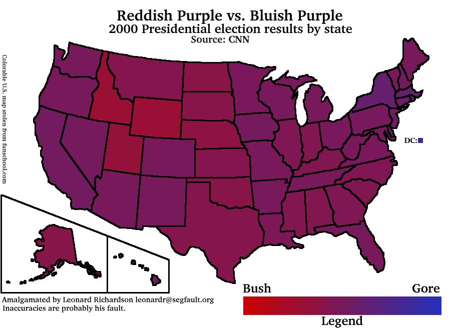
| The Red/Blue Map is a Load of Hockey |
| Printer Friendly | Permalink | | Top |
| The Screaming Icon
|
Wed Oct-15-03 02:16 AM Response to Original message |
| 1. Black and Blue |
| Printer Friendly | Permalink | | Top |
| Loyal
|
Wed Oct-15-03 02:18 AM Response to Reply #1 |
| 2. I don't think he made the map |
| Printer Friendly | Permalink | | Top |
| QC
|
Wed Oct-15-03 02:48 AM Response to Reply #1 |
| 4. I didn't make the map, baby. |
| Printer Friendly | Permalink | | Top |
| bearfartinthewoods
|
Thu Oct-16-03 09:53 AM Response to Reply #4 |
| 29. why does clicking on the image link initiate a download? |
| Printer Friendly | Permalink | | Top |
| Feanorcurufinwe
|
Wed Oct-15-03 02:18 AM Response to Original message |
| 3. I totally agree |
| Printer Friendly | Permalink | | Top |
| eileen_d
|
Wed Oct-15-03 09:09 AM Response to Reply #3 |
| 9. Hi! Me too! |
| Printer Friendly | Permalink | | Top |
| indigo32
|
Wed Oct-15-03 02:40 PM Response to Reply #3 |
| 20. Go Montana |
| Printer Friendly | Permalink | | Top |
| JCMach1
|
Wed Oct-15-03 04:15 AM Response to Original message |
| 5. I saw a red/blue map that resized according to population |
| Printer Friendly | Permalink | | Top |
| ShimokitaJer
|
Wed Oct-15-03 01:16 PM Response to Reply #5 |
| 16. election results vs. population density |
| Printer Friendly | Permalink | | Top |
| NewYorkerfromMass
|
Wed Oct-15-03 01:23 PM Response to Reply #16 |
| 17. only that southern New Hampshire is full of |
| Printer Friendly | Permalink | | Top |
| Lisa
|
Wed Oct-15-03 02:15 PM Response to Reply #5 |
| 18. what we want is an "equal-area cartogram" |
| Printer Friendly | Permalink | | Top |
| Mairead
|
Wed Oct-15-03 04:18 AM Response to Original message |
| 6. I note, though, that they're all portrayed as warm purples, which |
| Printer Friendly | Permalink | | Top |
| NewYorkerfromMass
|
Wed Oct-15-03 09:07 AM Response to Reply #6 |
| 8. That's right, and Nader votes should also add to the "blue" spectrum |
| Printer Friendly | Permalink | | Top |
| JHB
|
Wed Oct-15-03 09:13 AM Response to Reply #8 |
| 10. No, it was done properly... |
| Printer Friendly | Permalink | | Top |
| NewYorkerfromMass
|
Wed Oct-15-03 12:29 PM Response to Reply #10 |
| 11. No it wasn't. |
| Printer Friendly | Permalink | | Top |
| JHB
|
Wed Oct-15-03 12:42 PM Response to Reply #11 |
| 13. It wasn't made using CBMR... |
| Printer Friendly | Permalink | | Top |
| NewYorkerfromMass
|
Wed Oct-15-03 12:55 PM Response to Reply #13 |
| 15. Wait a minute...there's no green for anyone |
| Printer Friendly | Permalink | | Top |
| Mairead
|
Thu Oct-16-03 09:22 AM Response to Reply #13 |
| 26. CBMR? Where's that from? |
| Printer Friendly | Permalink | | Top |
| Friar
|
Wed Oct-15-03 04:24 AM Response to Original message |
| 7. Hockey? |
| Printer Friendly | Permalink | | Top |
| Mike_from_NoVa
|
Wed Oct-15-03 12:39 PM Response to Original message |
| 12. Hey, Don't Badmouth Hockey!!! |
| Printer Friendly | Permalink | | Top |
| ShimokitaJer
|
Wed Oct-15-03 12:48 PM Response to Reply #12 |
| 14. I'll hazard a guess that he meant "horse pucky" |
| Printer Friendly | Permalink | | Top |
| donotpassgo
|
Wed Oct-15-03 02:36 PM Response to Original message |
| 19. So Bush is the King of the vast barren wastelands? |
| Printer Friendly | Permalink | | Top |
| greendog
|
Wed Oct-15-03 02:49 PM Response to Reply #19 |
| 21. Vast barren wasteland? |
| Printer Friendly | Permalink | | Top |
| ShimokitaJer
|
Wed Oct-15-03 03:01 PM Response to Reply #21 |
| 23. Try driving from Colorado to California sometime |
| Printer Friendly | Permalink | | Top |
| whirlygigspin
|
Wed Oct-15-03 02:59 PM Response to Reply #19 |
| 22. media & geography |
| Printer Friendly | Permalink | | Top |
| AntiCoup2K4
|
Wed Oct-15-03 03:09 PM Response to Reply #22 |
| 24. Idaho? Fuhgettabout it |
| Printer Friendly | Permalink | | Top |
| Ivory_Tower
|
Wed Oct-15-03 03:36 PM Response to Original message |
| 25. More accurately you'd want to consider "vote density" |
| Printer Friendly | Permalink | | Top |
| NewYorkerfromMass
|
Thu Oct-16-03 09:25 AM Response to Reply #25 |
| 27. Great work |
| Printer Friendly | Permalink | | Top |
| treepig
|
Thu Oct-16-03 09:54 AM Response to Reply #25 |
| 30. I am interested in how you determined the "voting population density" |
| Printer Friendly | Permalink | | Top |
| Brian Sweat
|
Thu Oct-16-03 09:52 AM Response to Original message |
| 28. Two guys were flying around in a helicopter over Seattle. |
| Printer Friendly | Permalink | | Top |
| Ivory_Tower
|
Thu Oct-16-03 09:56 AM Response to Reply #28 |
| 31. I think that's the point |
| Printer Friendly | Permalink | | Top |
| Brian Sweat
|
Thu Oct-16-03 10:22 AM Response to Reply #31 |
| 33. The point is invalid then. In Mass. Gore received almost |
| Printer Friendly | Permalink | | Top |
| NewYorkerfromMass
|
Thu Oct-16-03 10:27 AM Response to Reply #33 |
| 34. Exactly. Another way to do the map would be this: |
| Printer Friendly | Permalink | | Top |
| Ivory_Tower
|
Thu Oct-16-03 10:37 AM Response to Reply #33 |
| 35. I don't get it. |
| Printer Friendly | Permalink | | Top |
| Brian Sweat
|
Thu Oct-16-03 10:44 AM Response to Reply #35 |
| 36. The Texas Map is slightly redder and the Mass map is |
| Printer Friendly | Permalink | | Top |
| treepig
|
Thu Oct-16-03 10:56 AM Response to Reply #35 |
| 38. still, the number of votes in a state is not very meaningful, |
| Printer Friendly | Permalink | | Top |
| Catherine Vincent
|
Thu Oct-16-03 10:51 AM Response to Reply #31 |
| 37. That's what I tell people when they pull out that red/blue map. |
| Printer Friendly | Permalink | | Top |
| Brian Sweat
|
Thu Oct-16-03 11:26 AM Response to Reply #37 |
| 39. No, the map is trying to show who won the electoral college votes |
| Printer Friendly | Permalink | | Top |
| NewYorkerfromMass
|
Thu Oct-16-03 10:01 AM Response to Reply #28 |
| 32. That was, I'm afraid, the point of this exercise |
| Printer Friendly | Permalink | | Top |
| DU
AdBot (1000+ posts) |
Sun May 05th 2024, 07:45 PM Response to Original message |
| Advertisements [?] |
| Top |
| Home » Discuss » Archives » General Discussion (Through 2005) |
|
Powered by DCForum+ Version 1.1 Copyright 1997-2002 DCScripts.com
Software has been extensively modified by the DU administrators
Important Notices: By participating on this discussion board, visitors agree to abide by the rules outlined on our Rules page. Messages posted on the Democratic Underground Discussion Forums are the opinions of the individuals who post them, and do not necessarily represent the opinions of Democratic Underground, LLC.
Home | Discussion Forums | Journals | Store | Donate
About DU | Contact Us | Privacy Policy
Got a message for Democratic Underground? Click here to send us a message.
© 2001 - 2011 Democratic Underground, LLC