The 'Fat Map': Putting World Hunger Into PerspectivePrincess Haya Bint Al Hussein
UN Messenger of Peace
Posted: November 16, 2009 07:45 AM
Hunger now scars the lives of over 1 billion people -- a new record. Today, Monday the 16th, world leaders will gather at a UN food summit in Rome to debate what to do about it. As a former Goodwill Ambassador for the World Food Program, I sense how the meeting may go. There will be more media attention on the politicians than on the issues, an abundance of speeches, and a series of oddly fancy luncheons -- with more speeches. At a similar luncheon, I remember wondering: What if I could magically transfer the 1000 calories in this vanilla souffle in front of me to a malnourished child begging in the slums of Nairobi? Sharing the extra calories eaten in the United States or Europe alone would end hunger in Africa.
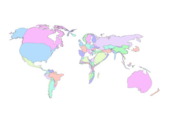
These gratifying fantasies highlight some terrible inequities in how the world handles its food supply. In 2006, the World Food Program produced, but never publicly released, a map charting food consumption. Dubbed the "Fat Map," it shows where the world's calories go. Nations grow or shrink based on how much the average person eats. Depending on your perspective, it maps starvation or overeating.
<snip>