In the TOD article
World Oil Supplies as Reported in EIA�s most recent International Energy Statistics author Rune Likvern presents a breakdown of current and historical oil production in different parts of the world. He also reports the world's total production for the last 10 years:
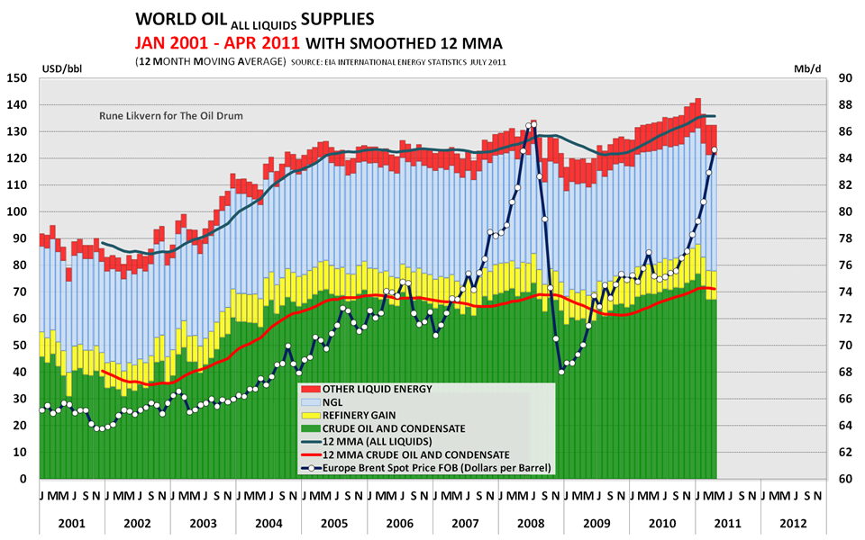
Now, in a typical graph like this there is always a certain amount of "apples and oranges" comparison. It lumps together the simple volumes of various "oil-like" products, each of which contains a different amount of energy per barrel. While this tells you the total volume of liquid fuel production, it doesn't give an accurate picture of the total energy. You need to know that in order to determine how much energy-driven stuff our civilization can actually do.
In order to get a better estimate of the energy we're producing/consuming, Likvern reworked the data to give a more accurate picture of the actual amount of energy we're producing in the form of liquid fuels. This rework takes into account the different energy densities of such things as NGL and various biofuels, and doesn't double count the category of "refinery gains" that are just a volumetric expansion that doesn't produce any additional energy.
Here's the adjusted graph:
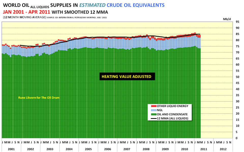
I have a couple of issues with these two graphs, not least the fact that one is zero-scaled and the other is not. However, a couple of things are quite clear. The first is the obvious plateau in crude oil production since mid-2004. The second is that the other forms of liquid energy (including NGL) haven't made much headway in supplementing crude oil over that same period. On an energy-adjusted basis they have added the equivalent of just 1 mbpd over the last 6 years, for an average gain of 0.2% per year.
And a couple of other notes:
Likvern comments that the EIA is currently projecting world consumption of 89 mbpd for the second half of this year. Even in the most generous assessment we are currently 2.5 mbpd short of that supply. With Libya still off-line this gap may be hard to close. In light of that shortfall, consider the price line for Brent Crude in the first graph. We are already heading back into "all-time-high" territory. Given the expected supply shortfall over the next six months the price has nowhere to go but up.
I'm convinced that the 2008 crash was triggered by the impact of $130 oil on a world economy that was structurally unstable. We have not fixed that instability, and recent events in Europe hint that the world economy may have even gotten somewhat more unstable in the last 3 years. And here comes another oil price spike.
Hold onto your hats.