Zogby released a huge batch of state polls yesterday that were taken via online survey. So that we may have our terminology straight,
Zogby Interactive is the online polling
method established by
Zogby International. This batch of state polls was conducted online for 34 different states between June 11 and June 30 (median date June 21).
View the data for all 34 of Zogby Interactive�s state polls at FiveThirtyEight.com.
According to their website, this is how the online polling method works:
1. Complete the online registration page and submit it to us.
2. Zogby Interactive will e-mail you and inform you when an online poll is ready for you to take.
3. Complete the survey. (Easy? We thought so.)
4. Zogby International will e-mail you and inform you when results are available to view.
5. See how your opinion stacks up.
6. Be ready to voice your opinion with the leading public opinion pollster in the world. If you would like the results of the poll you took (as well as other poll results and Zogby International information), be sure to check the check-box asking if you would like Zogby International press releases and other Zogby information sent to you in the future.
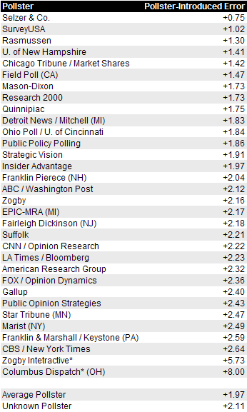
http://interactive.zogby.com/pollregistration/registration/index.cfm?refsite=news What is the usefulness of these polls? Zogby calculates the margin of error for each �interactive� poll to be between 2% and 5%, but they neglect to consider in their margins of error that this type of polling is strictly �members only� � You must register, and in order to participate, you must own a computer (or have a computer available) and an internet connection and an email address.
Do you know of another organization that allows people to participate in polls as long as they are members, with a computer, and with online access? I do. Democratic Underground. :7
These interactive polls do have one thing going for them � they are better than outdated polls. Even an interactive poll is better than no poll at all, and an outdated poll is equivalent to no poll. So I�ll use these polls only in extreme circumstances, but with zero weight. Only four of the 34 polls meet these criteria, since the previous outdated polls for these states were from February 28 (AR, IL), April 3 (MD) and June 2 (SC). If any of these polls change a state from one color to the other on the map (which it did for Arkansas and South Carolina), I�ll show a disclaimer below the map. New polls for these four states will be released soon and will replace these mostly useless interactive polls.
The polls released since yesterday:
Arkansas � Obama 41, McCain 39, Barr 4, Nader 1 (Zogby Interactive, 6/21, +/- 4.7, 461 LV) (Replaces outdated poll from February 28)
Illinois � Obama 52, McCain 32, Barr 5, Nader 1 (Zogby Interactive, 6/21, +/- 2.6, 1514 LV) (Replaces outdated poll from February 28)
Maryland � Obama 54, McCain 30, Barr 6, Nader 1 (Zogby Interactive, 6/21, +/- 3.3, 924 LV) (Replaces outdated poll from April 3)
South Carolina � Obama 42, McCain 41, Barr 6, Nader 1 (Zogby Interactive, 6/21, +/- 4.0, 630 LV) (Replaces outdated poll from June 2)
Missouri � Obama 45, McCain 50 (Rasmussen, 7/7, +/- 4.5, 500 LV)
Missouri � Obama 44, McCain 47 (Public Policy Polling, 7/5, +/- 3.6, 723 LV)
New Jersey � Obama 47, McCain 44 (Rasmussen, 7/7, +/- 4.5, 500 LV)
Kansas � Obama 36, McCain 49 (TargetPoint-R, 7/1, +/- 2.0, 3004 RV)
Alabama � Obama 36.4, McCain 48.8 (AEA/Capital Survey, 7/1, +/- 4.3, 536 LV)
 ^ This is what we refer to as the �Widget�. In the white section, it shows Obama�s and McCain�s electoral vote projection from three different sources. 270 would be a majority. In the yellow section, it shows three sources of trading and averages for the candidates. The scale for these is 0 to 100, with 50 being a majority. Intrade shows the trading, while RCP-av shows the aggregate average of all the state polls. The Wigand Electoral Average is our own indicator, and shows how the candidates will do if the undecideds nationwide break the same way as the swing states.
 ^ The Wigand Electoral Average is our own indicator, and shows how the candidates will do if the undecideds nationwide break the same way as the swing states. Each of the twelve swing states are listed below the indicator�s current score. The closing figures on Intrade are shown next to each state, with a column to show the change from the previous day. The scale for these is 0 to 100, with 50 being a majority.
* * * * * * *
DAILY TRACKING ^ This graph shows the daily tracking of Obama�s projected electoral votes from three sources. 270 is a majority of the electoral votes. The blue line shows daily tracking from 538.com, which projects what the outcome should be on election day. The red line shows daily tracking from Electoral-Vote.com, which shows a current snapshot of Obama�s electoral progress if the undecideds break evenly. The green line is my own projection, and it shows a current snapshot of Obama�s electoral progress if the undecideds break the same way as the swing states. A trend line is used (dashed green line) to show the average progress since May 19 and possible route for the next seven days.
 ^ This graph shows Obama�s green line and red line from the previous graph, and compares it to John Kerry�s 2004 progress (orange line) as shown from Electoral-Vote.com. (Both the red line and the orange line show data from Electoral-Vote.com)
 ^ Wigand vs. National Polls. The Wigand Electoral Average uses both poll averages and trading (swing states), and this graph compares it to the national tracking polls from Gallup, Rasmussen and Real Clear Politics (average).
 ^ This graph shows the daily tracking of the swing states total from the Wigand Electoral Average widget above (second chart from the top). The scale is 0 to 1200, with 600 being a majority. It is currently at 671.70 (the highest it has ever been). To show Obama�s progress in the swing states, divide the latest closing figure (671.70) by 1200. Obama is winning the swing states by 55.98%, compared to 44.02% for McCain.
 ^ Wigand vs. Trading. The Wigand Electoral Average uses both poll averages and trading (swing states), and this graph compares it to the closing trading figures from Intrade (people buying shares with real money) and Rasmussen Markets (people using fake money).
 ^ I am projecting 126,750,000 million votes on election day, which is the total 2004 votes plus population growth for each state. A total projected popular vote is calculated for each candidate based on projected votes on election day this year multiplied by each state�s current poll results. This graph shows the daily tracking of the popular vote calculations.
 ^ This graph shows the daily tracking of each swing state�s closing figure on Intrade. The scale is 0 to 100 with 50 being a majority. I commonly refer to the range from 40.00 to 60.00 as �The Zone� because the states in The Zone are true swing states this year.
* * * * * * *
 (Disclaimer: The polls from Arkansas and South Carolina were
conducted by �Zogby Interactive� and should be given zero weight.)Yesterday�s WidgetFull Weekly TrackingPast editions of THE MATHSources:
Pollster.com
FiveThirtyEight.com
Electoral-Vote.com
Intrade
Rasmussen Markets
RCP Average
RCP Latest PollsWhat is this? THE MATH�s Daily Widget was created to track multiple daily sources which measure the potential success of Barack Obama�s presidential campaign. Projected Electoral Votes are on a scale of 0 to 538, with 270 being a majority, or projected win. Trading and Averages are on a scale of 0 to 100, with 50.1 being a majority, or projected win.
The Wigand Electoral Average uses public polling results to determine base states for both parties and a short list of swing states, and combines the actual electoral votes from base states with a weighted Intrade calculation for electoral votes from swing states to derive an average on a scale of 0 to 100. On this scale, greater than 50.00 is considered a win for Barack Obama. An average of 50.10 would yield 270 electoral votes, and an average of 100.00 would yield 538 electoral votes. More Information As always, I�m open to your feedback and suggestions, and I will be happy to explain anything!Feel free to use these charts and graphs anywhere on Democratic Underground.
Donate to the Obama Campaign today through DU�s donation link at Barack Obama�s website:
http://my.barackobama.com/page/outreach/view/main/du