General Discussion
Related: Editorials & Other Articles, Issue Forums, Alliance Forums, Region ForumsThis map shows why it would be 'terrifying' to open Canada-U.S. border
https://toronto.ctvnews.ca/this-map-shows-why-it-would-be-terrifying-to-open-canada-u-s-border-1.5012933#_gus&_gucid=&_gup=twitter&_gsc=M0D1fDV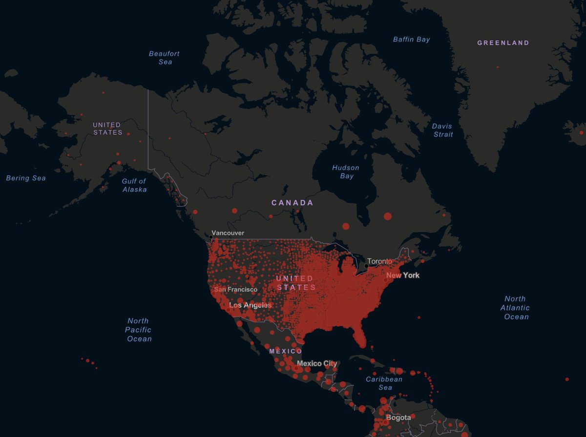
 = new reply since forum marked as read
Highlight:
NoneDon't highlight anything
5 newestHighlight 5 most recent replies
= new reply since forum marked as read
Highlight:
NoneDon't highlight anything
5 newestHighlight 5 most recent replies

No, they shouldn't open it. The U.S. is obviously the Typhoid Mary of the world now.

Wounded Bear
(58,726 posts)
Boxerfan
(2,533 posts)The Canadian dots are somewhat random in placement. And there logically would be bleed over across the densely populated sections of the border.
Not saying we are not the typhoid Mary of the world but that map looks derived not data driven.

Wednesdays
(17,420 posts)which are much larger swaths of land.
The dots on the U.S. map are of counties.
So, the map is a bit misleading. For example, the dot in Quebec is quite large, but is set in the middle of the province, far away from where most people actually live. This gives a false impression that there are few infections along the border. If the Canadian map were of smaller geographic areas, the distribution of dots would be somewhat closer to that of the U.S.
Note that like Canada, the dots on the Mexican map show a similar wide distribution.

GemDigger
(4,305 posts)WestCoastYellowDog
(55 posts)He acknowledges the US reports on a more localized level.
My personal belief is even when you’re right in the main, misleading charts or graphics detract from your point.
roamer65
(36,747 posts)No Americans allowed.
Freight can switch to different trucks near the border.