Welcome to DU! The truly grassroots left-of-center political community where regular people, not algorithms, drive the discussions and set the standards. Join the community: Create a free account Support DU (and get rid of ads!): Become a Star Member Latest Breaking News General Discussion The DU Lounge All Forums Issue Forums Culture Forums Alliance Forums Region Forums Support Forums Help & Search

Roland99

(53,342 posts)
Tue Apr 15, 2014, 08:40 PM Apr 2014

A tale of two graphs

MarketWatch:

(source attributed to The White House)

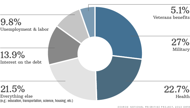
CNN:

(source attributed to National Priorities Project)

Some non-negligible differences between the two.

interesting....


Ah...missed this:

Note: The National Priorities Project's calculations exclude payroll taxes. Payroll taxes fully pay for Social Security benefits. But they only cover a portion of Medicare's expenses -- the remainder is covered by general federal revenue and premiums


Not sure if the White House data does or doesn't.

2 replies = new reply since forum marked as read
Highlight: NoneDon't highlight anything 5 newestHighlight 5 most recent replies
A tale of two graphs (Original Post) Roland99 Apr 2014 OP
Both are about income tax; here are some explanations for both muriel_volestrangler Apr 2014 #1
I think this just highlights the issue with media and stats Roland99 Apr 2014 #2

muriel_volestrangler

(101,320 posts)
1. Both are about income tax; here are some explanations for both
Tue Apr 15, 2014, 08:54 PM
Apr 2014

White House figures: http://www.whitehouse.gov/2013-taxreceipt (click on plus signs to expand categories, hover over them to get a budget function number - eg for net interest, it's 900)
National Priorities Project figures: http://nationalpriorities.org/analysis/2014/tax-day-2014/notes-sources/ (eg for interest, it's subfunctions: 901, 902, 903, 908, 909)

How 900 relates to the subfunctions must be explained somewhere else. Exercise for reader.

Roland99

(53,342 posts)
2. I think this just highlights the issue with media and stats
Tue Apr 15, 2014, 08:59 PM
Apr 2014

Anything can be made to fit a specific meme or push an agenda slightly over another.

For example, every time I hear or read a stat about what % of America's wealth is owned by what % of the population, it's always different numbers.

The truth/actual numbers *should* be significant enough for anyone to see/hear and realize what's going on w/o fluff/sensationalism being added in.

Latest Discussions»General Discussion»A tale of two graphs