General Discussion
Related: Editorials & Other Articles, Issue Forums, Alliance Forums, Region Forums26 charts and maps that show the world is getting much, much better
26 charts and maps that show the world is getting much, much better
by Dylan Matthews on December 29, 2014
The press — and humans in general — have a strong negativity bias. Bad economic news gets more coverage than good news. Negative experiences affect people more, and for longer, than positive ones. So it's natural for things like Russia's incursion into Ukraine or the rise of ISIS or the Ebola outbreak to weigh on us more than, say, the fact that extreme poverty has fallen by half since 1990, or that life expectancy is increasing, especially in poor countries. But it's worth paying some attention to the latter factors. The world is getting much, much better on a whole variety of dimensions. Here are just a few.
Economic progress
Our World in Data / Max Roser
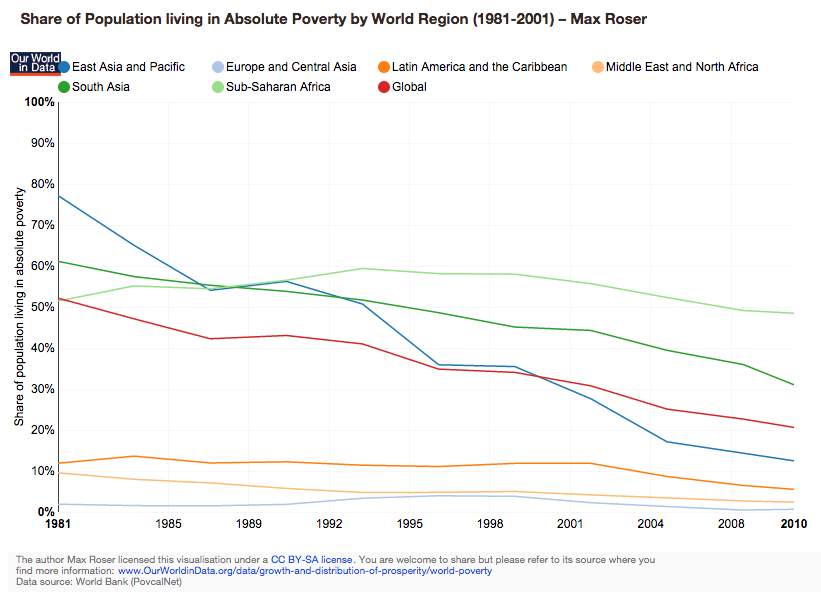
Extreme poverty has fallen
This is probably the most important chart on this list. The extraordinary rate of economic growth in India and China — as well as slower but still significant growth in other developing countries — has led to a huge decline in the share of the world population living on less than $1.25 a day, from 52 percent in 1981 to 43 percent in 1990 to 21 percent in 2010. That's a low bar for what counts as poverty, and some development experts are arguing we should be using a global poverty line of $10-15 a day instead, but that very debate is a sign of the tremendous progress made in recent decades.
more...
http://www.vox.com/2014/11/24/7272929/charts-thankful
 = new reply since forum marked as read
Highlight:
NoneDon't highlight anything
5 newestHighlight 5 most recent replies
= new reply since forum marked as read
Highlight:
NoneDon't highlight anything
5 newestHighlight 5 most recent replies

Andy823
(11,495 posts)This won't make the "doom and gloom" crowd happy! 

babylonsister
(171,070 posts)it's a tough crowd, for sure!
I'm posting good news, damn the consequences! 

True Blue Door
(2,969 posts)Scuba
(53,475 posts)The recent upward trend would perhaps be too depressing.

eppur_se_muova
(36,266 posts)can't have that, now. 

pampango
(24,692 posts)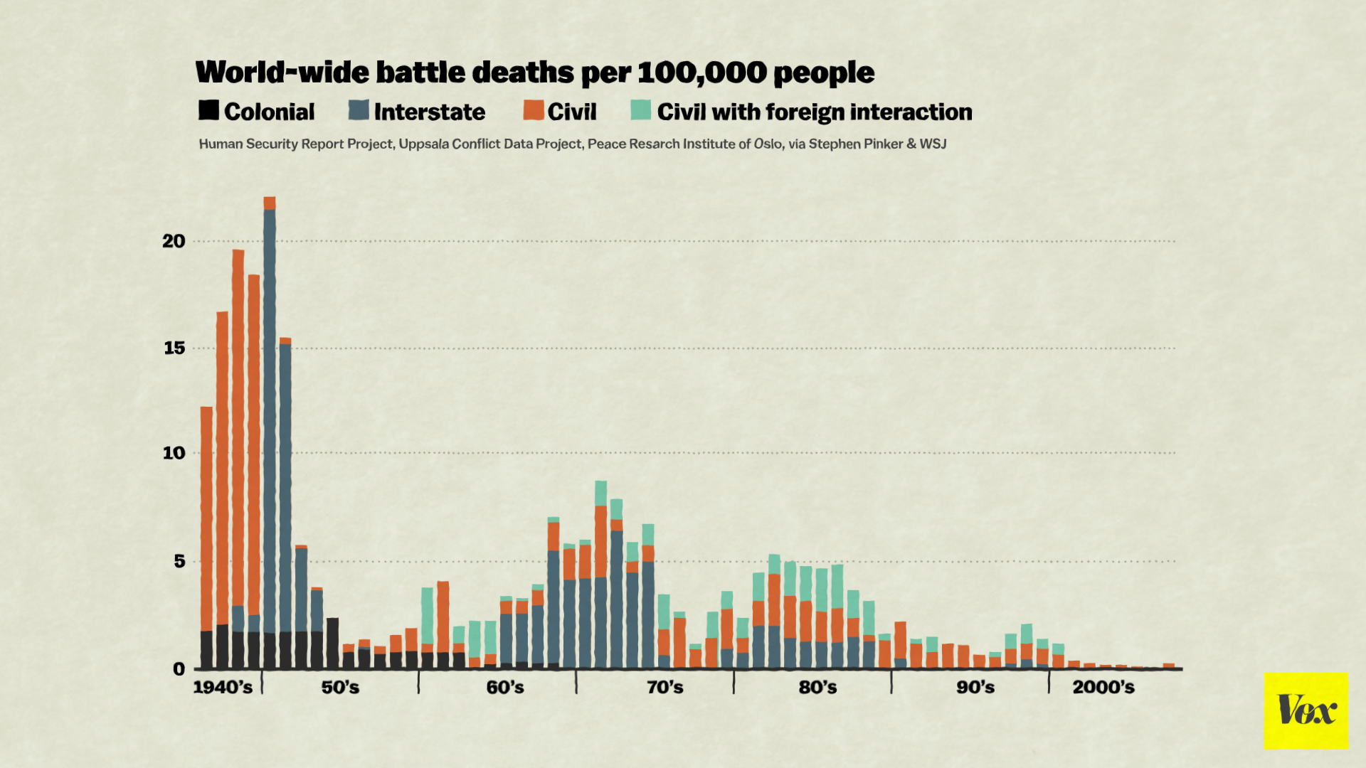
War is on the decline
Less than a century removed from the World Wars, it can be hard for people to believe that war is on the decline. But in the long run, deaths from organized political violence are falling, as Steven Pinker's The Better Angels of Our Nature details. "The rate of documented direct deaths from political violence (war, terrorism, genocide and warlord militias) in the past decade is an unprecedented few hundredths of a percentage point," Pinker wrote in an excerpt in the Wall Street Journal.
It's not just Pinker either: analysts like John Mueller, Joshua Goldstein, and John Horgan have persuasively argued that the end of war is in sight. "War is merely an idea," Mueller writes. "Unlike breathing, eating, or sex, war is not something that is somehow required by the human condition or by the forces of history. Accordingly, war can shrivel up and disappear, and it seems to be in the process of doing so."