General Discussion
Related: Editorials & Other Articles, Issue Forums, Alliance Forums, Region ForumsJeb Bush tweeted his 2016 campaign logo.
Seriously. I think it looks amateurish, actually cartoonish. I have to wonder why they think this is what they should have gone with.
http://www.huffingtonpost.com/2015/06/14/jeb-bush-campaign-logo_n_7579494.html
 = new reply since forum marked as read
Highlight:
NoneDon't highlight anything
5 newestHighlight 5 most recent replies
= new reply since forum marked as read
Highlight:
NoneDon't highlight anything
5 newestHighlight 5 most recent replies

Renew Deal
(81,860 posts)The exclamation point and the font are weird. It looks like it belongs on a broadway production. But we all know why he couldn't use his last name.
JaneyVee
(19,877 posts)
riversedge
(70,239 posts)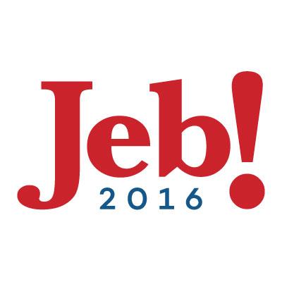

underpants
(182,824 posts)No, no it doesn't.

MH1
(17,600 posts)Not a good move for his campaign, in my opinion.
Chan790
(20,176 posts)but there it is.
Is 2016 going to be the year of the badly-designed political-campaign logo? I've seen nothing yet that even comes close in terms of quality to the Obama "O Sunrise" logo.
Gman
(24,780 posts)And thinks he got a good deal.

LiberalElite
(14,691 posts)Jeb.
(Yeah. ANOTHER Bush.)

hlthe2b
(102,283 posts)but both names elicit comparisons to the most backwards hillbilly one can imagine (again, with all due apologies to the "Jethro Clampitts" and any progressive "Jebs" there might be out there.
truebluegreen
(9,033 posts)"Is our Jeb (!) learning?" etc

FSogol
(45,488 posts)However, his advisory staff of every fuck-head that ever worked for his brother and Dad shows different.
BumRushDaShow
(129,060 posts)

Miles Archer
(18,837 posts)Said it didn't speak directly to their "core demographic."
I said "DID YOU READ THE TEXT? Of COURSE it does!"
Rejected it anyway. Still waiting to hear back from Rick Santorum to see if he liked the logo I sent HIM.


dixiegrrrrl
(60,010 posts)Permission to share it...everywhere????????
Miles Archer
(18,837 posts)

DamnYankeeInHouston
(1,365 posts)Jeb is his initials used to hide his name, John Ellis Bush.

tarheelsunc
(2,117 posts)hootinholler
(26,449 posts)
shenmue
(38,506 posts)