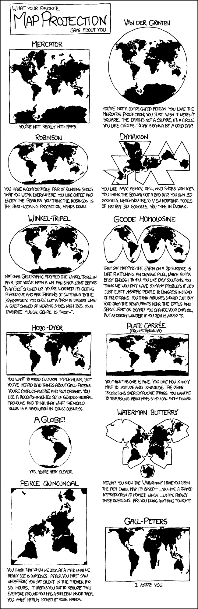
General Discussion
Related: Editorials & Other Articles, Issue Forums, Alliance Forums, Region Forums15 Maps Reveal How The World Actually Looks
Last edited Sat Jul 23, 2016, 10:23 AM - Edit history (1)
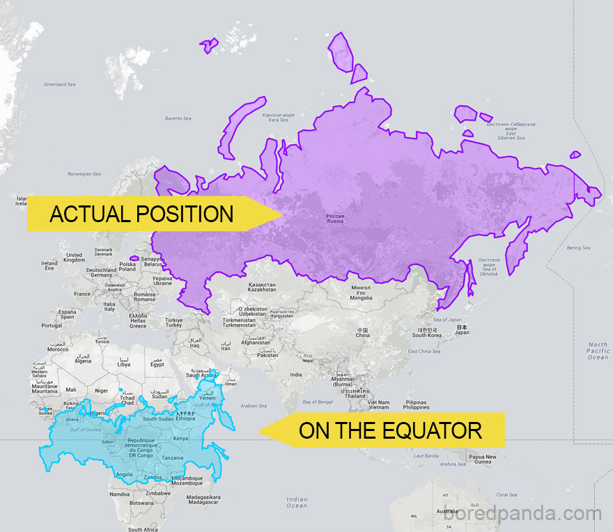
http://www.demilked.com/true-size-countries-mercator-map-projection-james-talmage-damon-maneice/?utm_source=feedburner&utm_medium=email&utm_campaign=Feed%3A+Demilked+%28DeMilked%29I found this very interesting.
[Img]
 [/img]
 = new reply since forum marked as read
Highlight:
NoneDon't highlight anything
5 newestHighlight 5 most recent replies
= new reply since forum marked as read
Highlight:
NoneDon't highlight anything
5 newestHighlight 5 most recent replies

lapfog_1
(29,205 posts)
edhopper
(33,587 posts)But stretches things out and is inaccurate for far north and south.
Try this
[img] [/img]
Spider Jerusalem
(21,786 posts)That's just silly, there isn't any inherent "bias" in the Mercator projection...yes, it distorts the size of land masses closer to the poles, but that's not to make the Northern Hemisphere countries look larger, it's because that's what happens when you try to flatten a sphere onto a rectangle and keep equidistant lines of latitude and longitude.
edhopper
(33,587 posts)and that is the reason it is in common use and not been exchanged for something more accurate.
Do you think if it showed Europe and N America tiny compared to Africa it would still be used?
Spider Jerusalem
(21,786 posts)It distorts landmasses near the poles equally. There's more land at a higher latitude in the northern hemisphere than in the southern hemisphere. Extreme northern Europe is at around 80 degrees north; by comparison, Tierra del Fuego is only at 54 degrees south (comparable to the latitude of the UK in the Northern Hemisphere) and the southernmost point of Tasmania is at 43 degrees south.
edhopper
(33,587 posts)if it is so inaccurate?
Anyway, I really didn't post this to indict the "White Man"
Just thought the more accurate Geography was interesting.
Most people do not realize how large Africa is compared to Europe.
Spider Jerusalem
(21,786 posts)and it's standard because it has straight and equidistant lines of latitude and longitude (although it's not really "the standard", it's "a standard", I remember having a National Geographic wall map that used the Robinson projection, for instance).
edhopper
(33,587 posts)I hate the spell-correct on this tablet sometimes. One wrong letter and you get a different word.
Fixed.

N_E_1 for Tennis
(9,734 posts)Mush better, so symple..no letting the pad putt wurds in my text.
edhopper
(33,587 posts)But I am une crapppy speiler.

eppur_se_muova
(36,269 posts)I remember our fourth grade classroom had a map more like this:
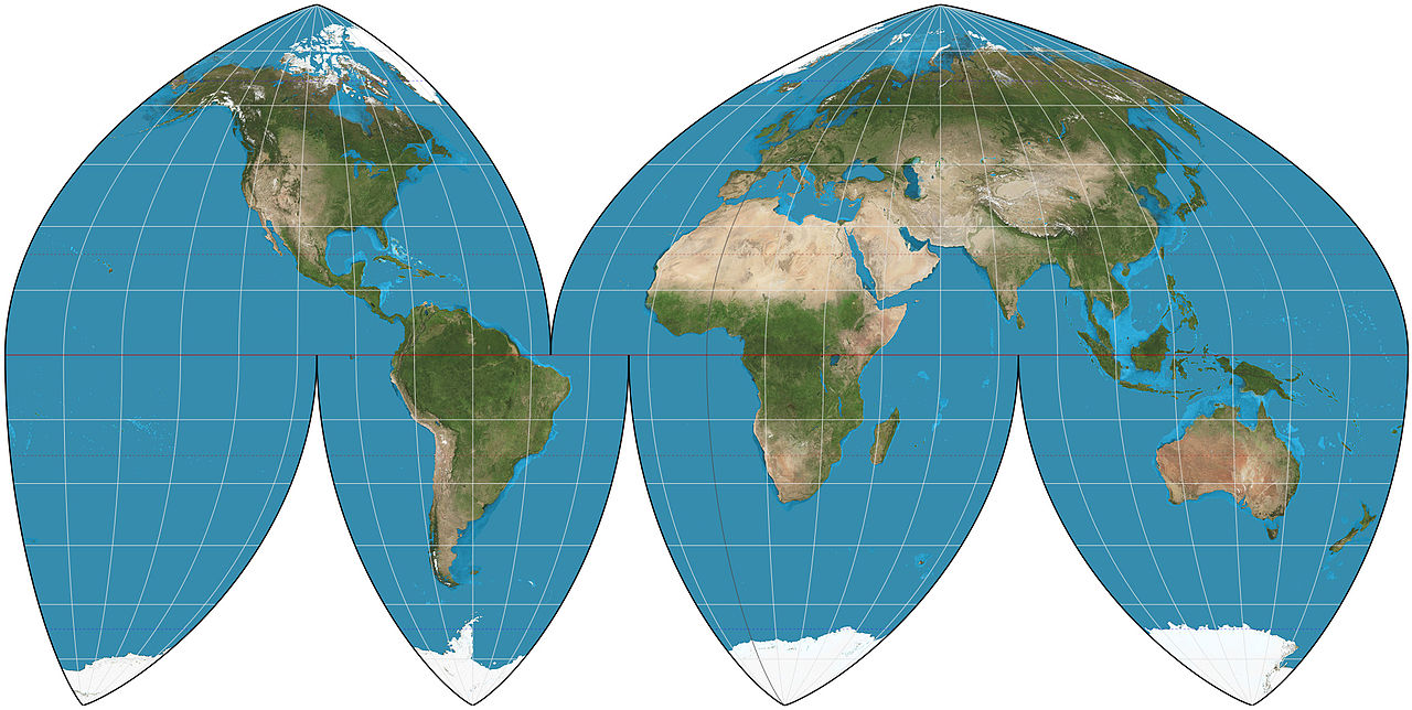
By Strebe - Own work, CC BY-SA 4.0, https://commons.wikimedia.org/w/index.php?curid=35708409
I remember our teacher pointing out that it had less drastic distortion than the Mercator projection. Apparently, even military planners get thrown by Mercator -- in arguing against the Bay of Pigs invasion, one officer pointed out that Cuba looked only about as big as Long Island on the map, but was in reality much larger. He then compared maps of Cuba and Iwo Jima to the same scale and described the horrendous casualties resulting from the battle to capture Iwo Jima from the Japanese. Sadly, not enough people listened to him.

malthaussen
(17,204 posts)... because the shortest distance between two points on one is always a straight line, which simplified navigation immensely back when one had to do all the calculations by hand. Less applicable now, when one has all sorts of electronic assistance.
-- Mal

Igel
(35,320 posts)That claim you can make stick.
On the other hand, a Pacific-centric map has to be off center a bit. https://commons.wikimedia.org/wiki/File:NewZealandEmbassies-PacificCentric.png
The choice of north/south is fairly arbitrary and of fairly late date. Perhaps because printing made the choice necessary once navigation became not getting 100 miles away but 2000 miles away so that maps weren't just little adhoc pieces of geographical description but part of a larger sphere that people would superimpose. Use big map to get to target area, use small map (with same orientation) to find the town and a smaller map to find the street in the town. A standard was necessary, and the printers decide such things. Perhaps because Polaris is "up" in some sense. Perhaps because we right on a horizontal line, so we accept setting maps next to each other but not above and below each other. Or maybe the monk who copied the version Ptolemy's map in the 1200s used by some influential cartographer who had his map printed in the first large run just exerted outsized and incidental influence.
A truly north-centric map would be centered on the north pole, and that makes the Southern hemisphere look yuuuuuge:
https://en.wikipedia.org/wiki/Azimuthal_equidistant_projection#/media/File:Azimuthal_equidistant_projection_SW.jpg
I sometimes like the reverse map of the Earth. We humans can far more easily mentally flip things left-right than we can up-down.
eppur_se_muova
(36,269 posts)
There have been many variations since. Fuller never intended for there to be a single, "correct" orientation of the map, and designed it to be reconfigured in various ways to illustrate different aspects of the Earth.
Lots of other possibilities: https://en.wikipedia.org/wiki/List_of_map_projections
edhopper
(33,587 posts)because I thought it was cool.
I have removed the cultural reference that became the focus.
eppur_se_muova
(36,269 posts)This despite China being a Northern Hemisphere country. Of course, this was before anyone (except for a few clever Greeks) had any real idea how far away the poles were, so it was a purely arbitrary choice, as was the choice in the West to place North at the top. Either one worked equally well at the time, but it was helpful to have everyone following the same convention.
edhopper
(33,587 posts)Larry Wilmore still does 
[img] [/img]

MowCowWhoHow III
(2,103 posts)