The DU Lounge
Related: Culture Forums, Support ForumsI'm been working on a new logo
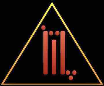
With my limited tools and skills, I've come up with this puppy:

I'd love a critique
Thanks
 = new reply since forum marked as read
Highlight:
NoneDon't highlight anything
5 newestHighlight 5 most recent replies
= new reply since forum marked as read
Highlight:
NoneDon't highlight anything
5 newestHighlight 5 most recent replies
Xyzse
(8,217 posts)If so, nicely done.
Otherwise, if not by you, I hope it is from someone that won't charge you.
Maybe use Mr. Scorpio as an arch on top of the Scorpion. Take off the red triangle, and place Musical Arsonist under the Scorpion. The Scorpion is shaped close to a Triangle pointing up too, which is a good thing.
MrScorpio
(73,631 posts)Did it all in Keynote.
I don't know if I can arch text with this program.
You don't like the triangle? I love the triangle. I wanted to base the logo on the damn thing
Well, I kinda figured that the Scorpion itself looks like a triangle. Which is why I mentioned that.
That way, the Scorpion looks more prominent and the text serves as the border to the triangle.

pinboy3niner
(53,339 posts)But with the reference to 'arsonist.' should flames be included somewhere? If so, you might consider black for a background color.
Whatever you do, don't add an eyeball to it!

MrScorpio
(73,631 posts)Now I wouldn't put fire in the triangle, but I might consider surrounding it with vector flames.
Hmmm. I just my try that.
Most def, no eyes.
pinboy3niner
(53,339 posts)...with a little alteration, the triangle itself could be the flames....just an idea.

sarge43
(28,941 posts)
Scuba
(53,475 posts)MrScorpio
(73,631 posts)
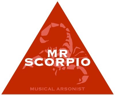
Scuba
(53,475 posts)Perhaps "musical arsonist" across the bottom in smaller type. Some very modest black shadowing on the scorpion? I'm not a graphic artist, more of a word guy.

LunaSea
(2,894 posts)Tighten up the space between Mr & scorpio, and the lower text too.
Try boosting the contrast a bit to keep the elements from visually overlapping.
Cool idea and execution.
MrScorpio
(73,631 posts)But I did this:

Whisp
(24,096 posts)the leading or space between Mr and Scorpio could be tighter. Drop it down a bit so you can have your name larger.
Musical arsonist could be a bit smaller - maybe as small as having the 3 words on one line.
and I'd make your scorpion as large as you can get it and still fit inside the triangle.
MrScorpio
(73,631 posts)

Tuesday Afternoon
(56,912 posts)Tuesday Afternoon
(56,912 posts)make the scorpion black ... and I like Musical Arsonist (in pink letters) on the bottom edge, yes.
Leave MR SCORPIO in white letters
MrScorpio
(73,631 posts)But I did change "Musical Arsonist" though
Tuesday Afternoon
(56,912 posts)the scale is much better on this one and the lettering size is excellent. you are getting there .
also, I like the triangle ... is there a way to position the scorpion (move it down and skew it to the right a tad) so that the claw on the left side is hooking toward the words at the bottom ...
MrScorpio
(73,631 posts)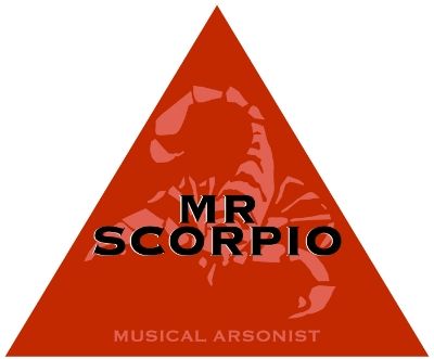
Tuesday Afternoon
(56,912 posts)MrScorpio
(73,631 posts)For thumbnails, I just may have to use the white lettering too
Tuesday Afternoon
(56,912 posts)I still think you need the scorpion to be a different color from the letters ... I like the red triangle and pink scorpion ... that is nice.
MrScorpio
(73,631 posts)I think that we have a winner!
Just posted it to my Twitter!
https://twitter.com/Mr_Scorpio
Tuesday Afternoon
(56,912 posts) 
In_The_Wind
(72,300 posts)