2016 Postmortem
Related: About this forumThe Romney Campaign concedes that their man isn't as likable as the President.
The Romney Campaign has a cartoon artist (that is also employed by the LDS Church) set up on an 'unofficial' site that was supposed to provide free graphic art for volunteers to use (and also raise money for the campaign).
It has been a ridiculous effort from the start and I have posted a couple of their most ludicrous attempts before.
Now http://mittfitts.com/ latest piece concedes the fact that Romney isn't very likable:

Completed before Romney demonstrated that he has no capability on foreign affairs whatsoever, the piece still is on the website and reflects the President's framing of the election that it is a 'choice election' and not a 'referendum election' as the Republicans had hoped.
The irony is overwhelming, and their inability to grasp it, sweet.
The OP is not responsible for ruined keyboards for those that click on the link.
 = new reply since forum marked as read
Highlight:
NoneDon't highlight anything
5 newestHighlight 5 most recent replies
= new reply since forum marked as read
Highlight:
NoneDon't highlight anything
5 newestHighlight 5 most recent replies

ncgrits
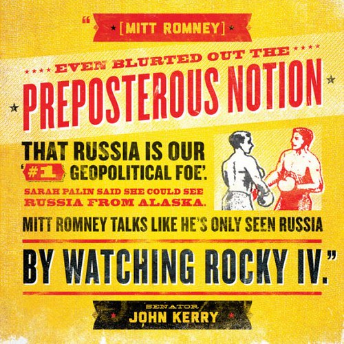
(916 posts)The pathetic message is bad enough! I'm even more offended by the typography. The design is just so . . . (no words) . . . bad.
As opposed to this typographic awesomeness!

gkhouston
(21,642 posts)dusts herself with flour and flicks water from the goldfish bowl on her face so her family will think that making rice crispy treats is hard work. 
For the record, I've had a great mechanic for years who is also likeable, and he never has grease smudges all over his face.

outsideworld
(601 posts)You are both un likable and incapable